what are you doing?
What were my actions?
so what?
What new questions do I have?
what's happened to me?
What was the result of my actions?
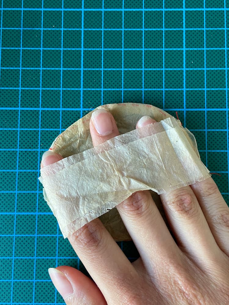
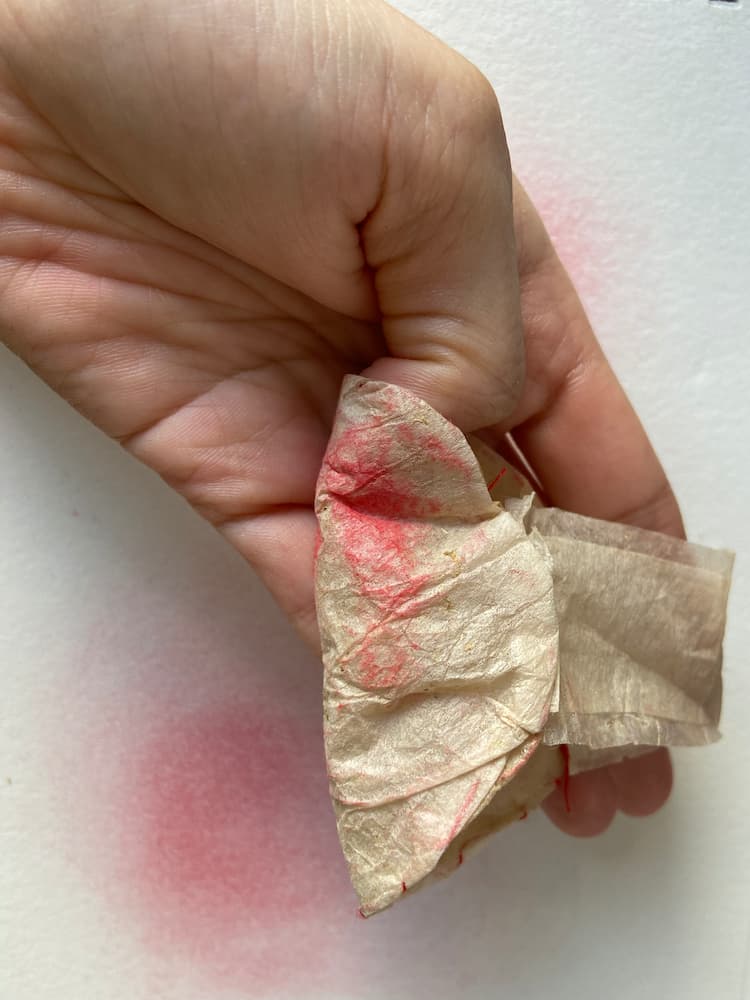
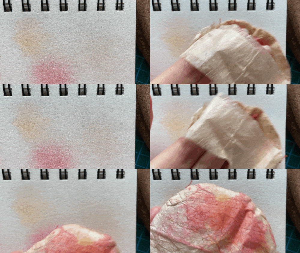
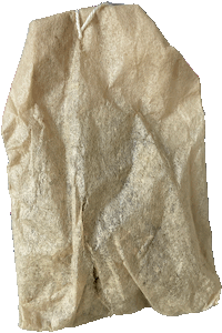
I was somewhat inspired by the design of those blush applicator puffs, as well as those tools I can't remember the name of that you use for evenly applying pressure on linocut prints. I made the surface in contact with the paper round to imply a circular motion, and added a handle as well to to let users know yes, your hand goes here. I also experimented with dabbing the tool onto the dust rather than have it contained within the bag.
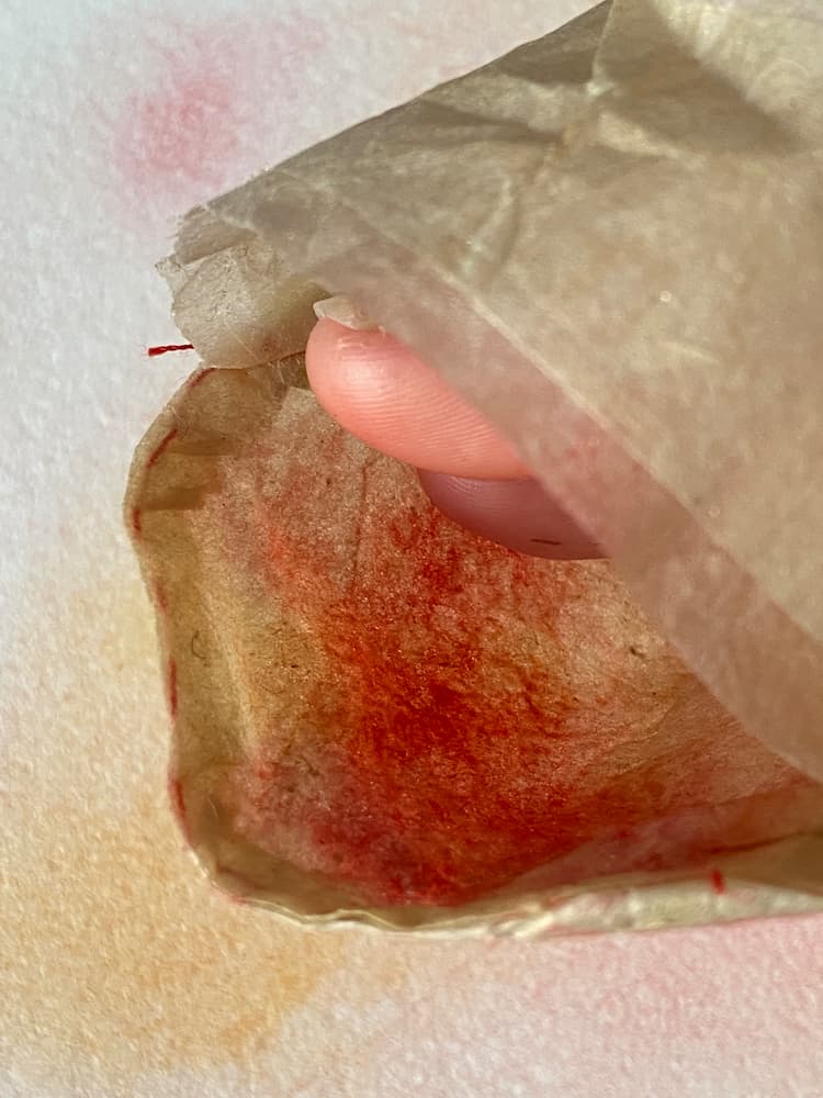
A particular design quirk is that the layer in contact with the fingers is soaked in the glue solution multiple times while the part in contact with the paper is the untreated tea bag. My hypothesis is that the glue will "protect" the hand from getting dirty while using the tool.
See below.
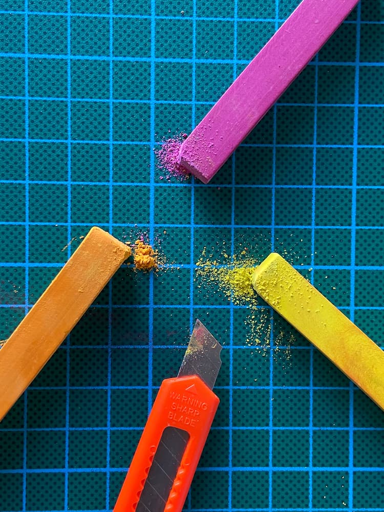
This is very promising! Potential upgrades include more layers to strengthen the tool, and more refined sewing techniques. Also, if I go down this route, I need to think of a method of storing the soft pastel dust and presenting it in a way that is amenable to the tool at hand.
what else do you need from me?
What does this mean for next steps?
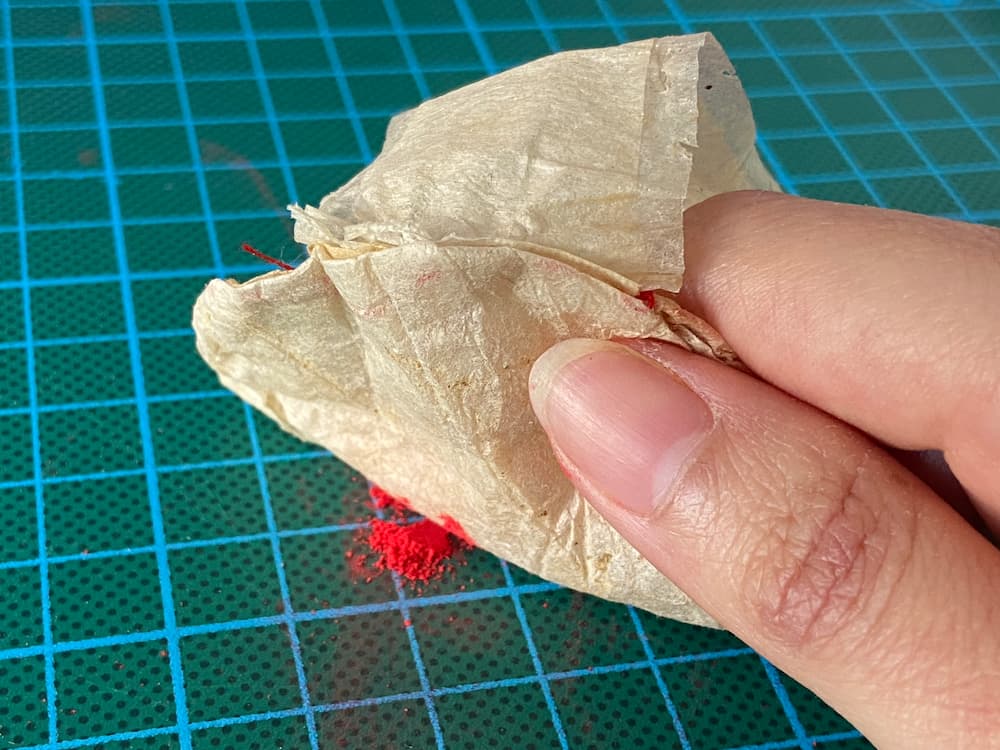
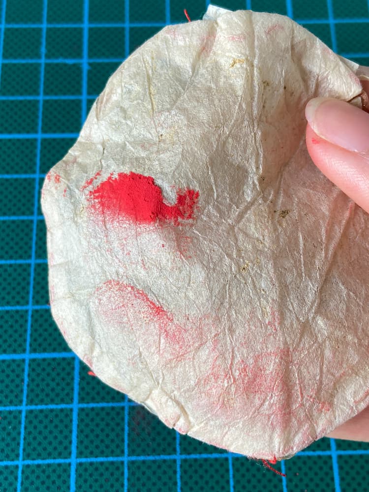
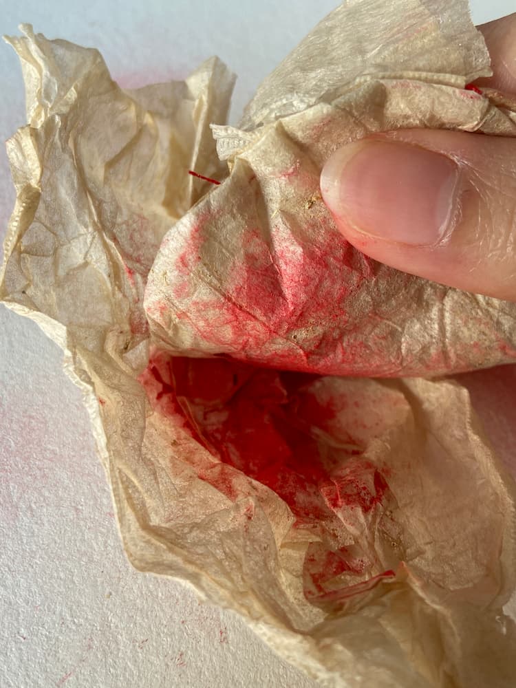
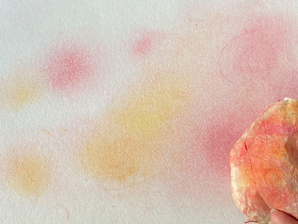
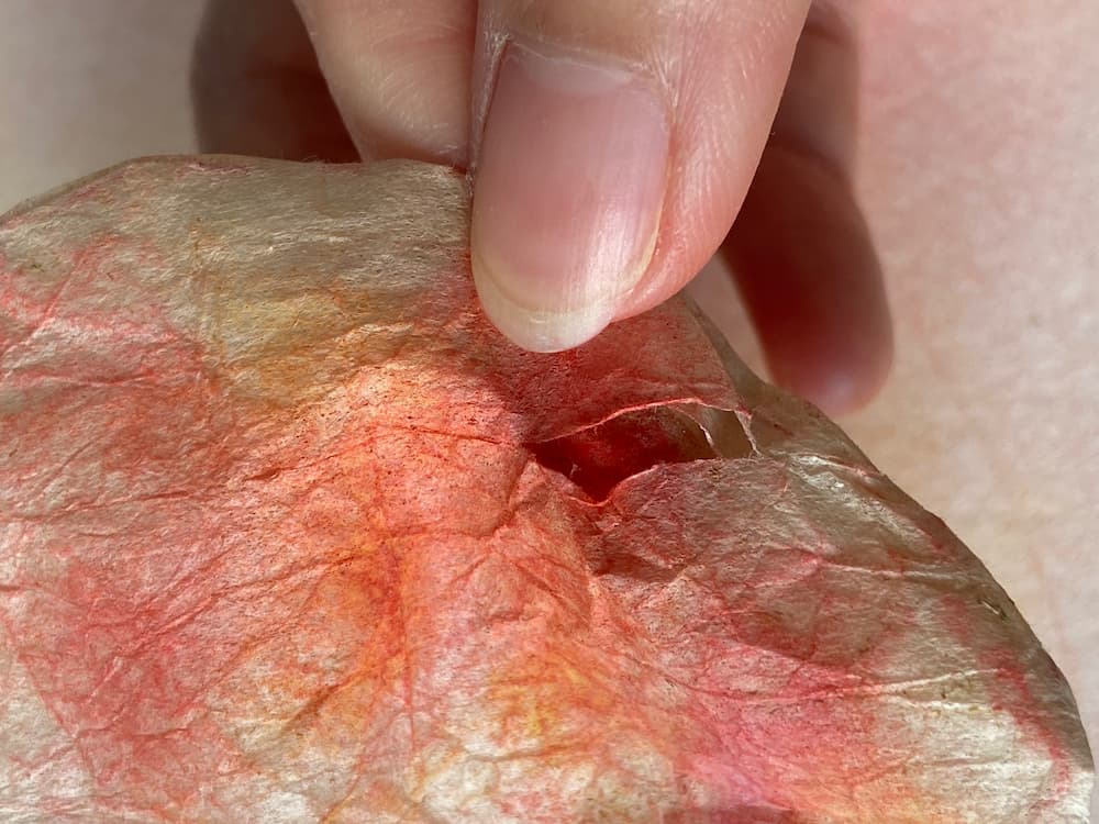
It works! It works? The actual user experience could be more polished, but this was more of an experiment to see whether the materials worked as intended in the first place. My fingers were surprisingly well protected, it was slightly confusing my brain seeing the red dust stain the inside of the tool while my fingers remained clean.
Having no barrier between the dust and the paper also obviously means colour transfer is easier, and it's simply more pleasurable to smoothly trace circles onto the paper rather than harshly rub to get the pigment in.
What was slightly unexpected was how well the dust particles got trapped within the pores. I realised after a bit of rubbing, the tool would get "stained" yet transfer no colour onto the paper. Also that part of the tool tore a little from the harsh rubbing, whoops.
I tested the design of the tool with Joup, presenting the piece out of context. He managed to guess its intention rather quickly, so that's a good sign that I'm getting this "affordances" thing.
what do you want?
What did I aim to do?
I have more or less settled on the idea of "creative therapy". I want you to become a tool for visual creation, but in a way that is guided by the feel rather than strictly trying to create a specific image. "Sensory play" comes to mind as well, though my audience isn't for children that young. Rather, I am looking for a design that guides the viewer, encourages them to think "play with me" rather than "race to the end with me". This is the first prototype of that experience.
who told you that?
What sources do I use to inform?
During a consultation with Joup, he suggested a bunch of wild ideas. Make it bigger, make it smaller. Use the tea leaves within the bags as pigment. How do you present it? How do you intend for people to use it? I don't think I can run as wild as he likes, but I'll sprint as far as I can.